 "AestheticsInMotion" (aestheticsinmotion)
11/04/2019 at 21:42 • Filed to: Photography help, Galaxy S10
 1
1
 29
29
 "AestheticsInMotion" (aestheticsinmotion)
11/04/2019 at 21:42 • Filed to: Photography help, Galaxy S10 |  1 1
|  29 29 |
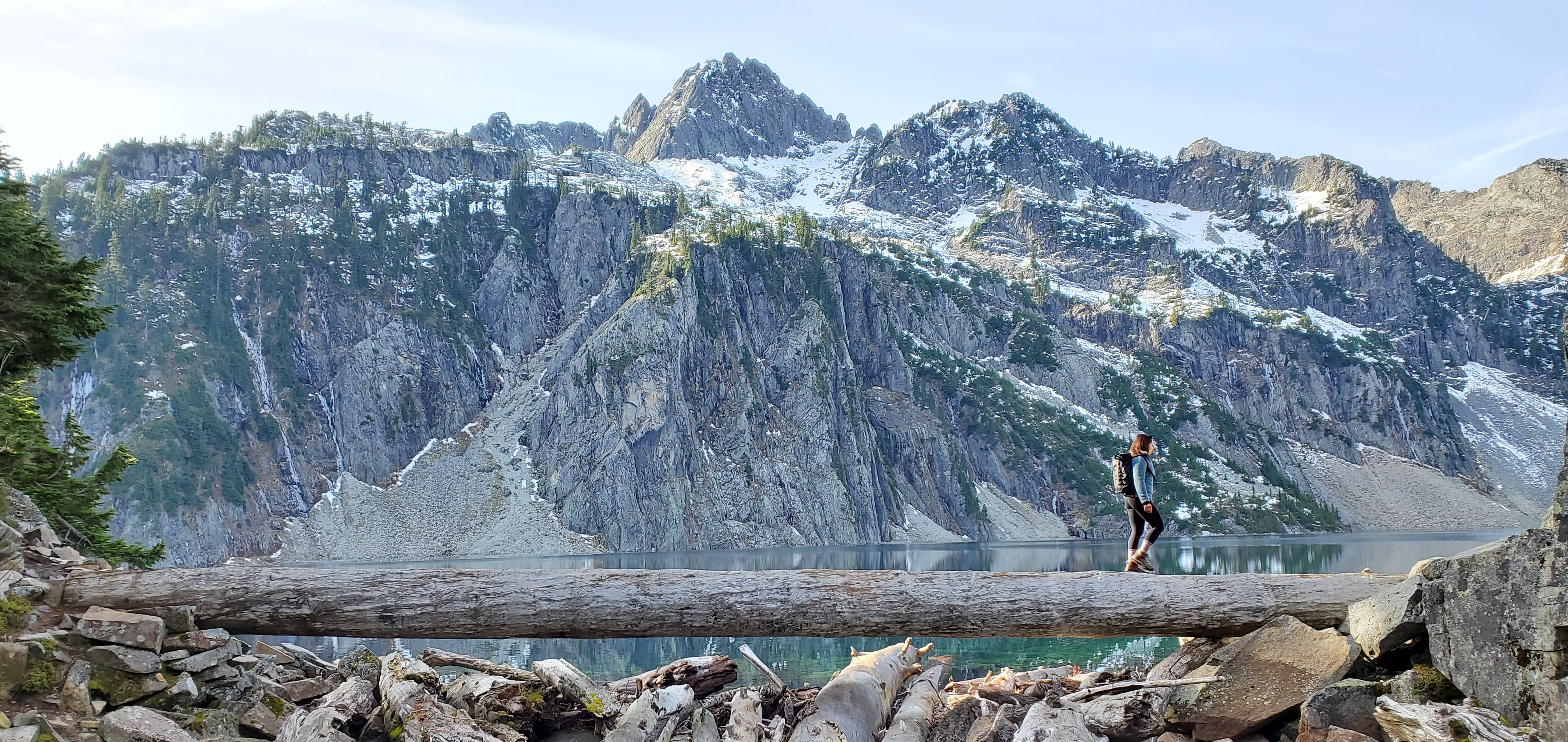
Or
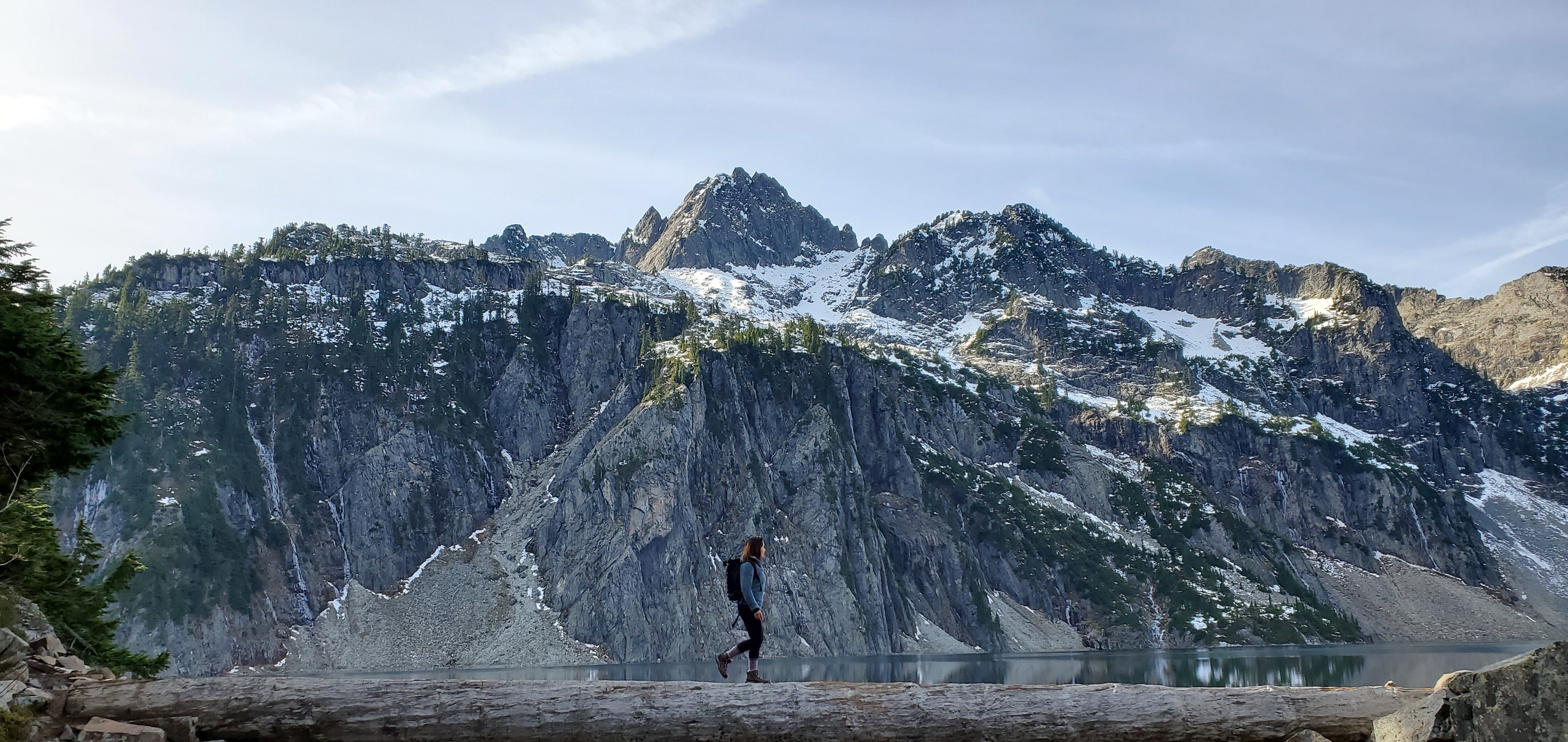
Framing, color, and position of the subject are the main three differences. I think I like the framing from the top picture, the centered subject f rom the bottom picture and the color.... I’m undecided on. But I'm going back and forth on everything.
 slipperysallylikespenguins
> AestheticsInMotion
11/04/2019 at 21:49 |
|
The framing and brightness look better on the top, but the centered subject looks better on the bottom. Where was this at?
 Michael
> AestheticsInMotion
11/04/2019 at 21:50 |
|
Top one for everything
Rule of 1/3rds
 AestheticsInMotion
> slipperysallylikespenguins
11/04/2019 at 21:52 |
|
Gem Lake, Washington State. I'll post more about it when I get the chance to do the place justice
 facw
> AestheticsInMotion
11/04/2019 at 21:53 |
|
I prefer the more vibrant color on top. The bottom just looks too dark and muted . I definitely like being able to see under the log as well, and I think the various debris works better at the bottom of the image than the log, which ends up feeling more cut off. I think the centered subject may be a bit more appealing, though honestly I feel like on the left might have been better still?
 AestheticsInMotion
> facw
11/04/2019 at 21:57 |
|
My friend didn’t know she was being photographed, I was too embarrassed to say anything! Looking at it now I wish I’d got her on the left like you said, but I kind of like avoiding “posed” photos... Maybe? I don't know
 Chan - Mid-engine with cabin fever
> AestheticsInMotion
11/04/2019 at 21:57 |
|
The lighting of #1 and composition of #2
 wafflesnfalafel
> Michael
11/04/2019 at 21:58 |
|
yeah, ditto - lighting is nicer in the top one, plus I like seeing how high the log is off the water. Beautiful shots - the only time I’ve been up there it was all socked in...
 VincentMalamute-Kim
> AestheticsInMotion
11/04/2019 at 21:59 |
|
Top.
Bottom with centered person makes everything too symmetric. Rule of 1/3's like @Michael mentioned.
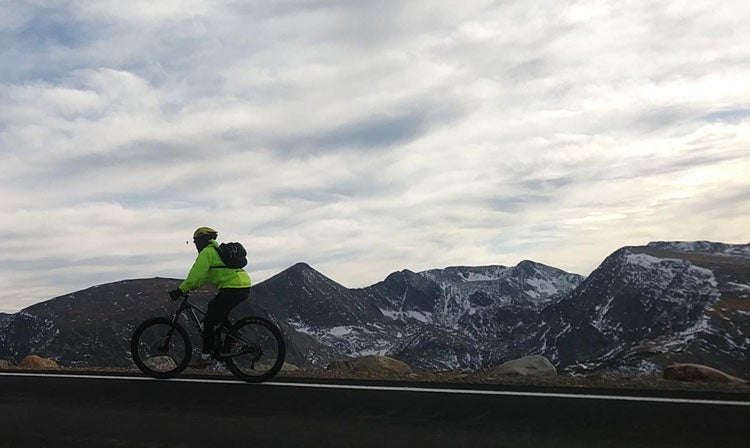
12,000ft on Trail Ridge Road, Rocky Mountain Nat Park a few weeks ago before it
closed
for the winter.
 ttyymmnn
> AestheticsInMotion
11/04/2019 at 22:01 |
|
The second one. I really like uncentered subjects, but the centered subject in the second shot helps portray the size of the mountains and the size of the space. It also balances with the tallest peak that is centered in your shot. If your subject were on the left side of the log, it would impart motion from left to right, with room to travel. A destination . It doesn’t work as well having her on the right.
That said, I like the framing better on the first one because you can see the whole log and what’s under and in front of it. The lighting is also better in the first one. So if you could recrop the second one and fix the lighting you would have a winner, IMO.
 facw
> AestheticsInMotion
11/04/2019 at 22:02 |
|
While I think left would be best, I don’t think centered or right are bad. Being on the right just means that instead of showing your subject taking in the beauty of the scene, you are instead showing her having almost successfully crossed the log, which can be powerful image as well (at least in the eyes of someone like me who has fallen on a log crossing)
 dieseldub
> AestheticsInMotion
11/04/2019 at 22:05 |
|
I think I like the top photo better as well, largely for the foreground rocks and the like. Not sure why, I just do. Seems to put the main subjects more centered as well.
Somewhere in the eastern Sierras?
 AestheticsInMotion
> VincentMalamute-Kim
11/04/2019 at 22:05 |
|
I really want to spend more time at 10k+ altitude. I think I’d perform a lot better a fter training in those conditions for a few weeks, as far as breathing and cardiovascular health goes
 CarsofFortLangley - Oppo Forever
> AestheticsInMotion
11/04/2019 at 22:06 |
|
top
 AestheticsInMotion
> dieseldub
11/04/2019 at 22:06 |
|
Less than two hours East of Seattle. 11 mile hike (round-trip)
 VincentMalamute-Kim
> AestheticsInMotion
11/04/2019 at 22:10 |
|
I have trouble distinguishing altitude vs being out of shape for my difficulties. Or both. Are you able to separate out
the impact of
altitude?
I was having a lot of trouble in that picture.
 AestheticsInMotion
> ttyymmnn
11/04/2019 at 22:10 |
|
I wonder if a skilled editor could do an overlap and get the person from the second shot into the first shot . I used to do that, but it was with photos shot from a tripod that were both positioned exactly the same...
 AestheticsInMotion
> CarsofFortLangley - Oppo Forever
11/04/2019 at 22:14 |
|
That's my favorite. The subject I'm question asked for the bottom one framed, which made me second-guess myself
 ttyymmnn
> AestheticsInMotion
11/04/2019 at 22:23 |
|
There are people here on Oppo who I’m sure could do that. All you really have to do is move the hiker to the center and fill the space she left behind.
 ttyymmnn
> dieseldub
11/04/2019 at 22:26 |
|
Having something in the foreground gives the photo more depth.
 MM54
> AestheticsInMotion
11/04/2019 at 22:31 |
|
I like the exposure/color and framing of the bottom picture better but the subject placement off-center of the upper.
 MM54
> AestheticsInMotion
11/04/2019 at 22:34 |
|
After spending half a week in C
olorado calling a cabin at 9500' home, near-sea-level Cleveland air was lush. And incredibly damp. I am far from athletic; didn’t have any issues with the altitude
other than being reminded I am not athletic much easier than usual.
 ttyymmnn
> Michael
11/04/2019 at 22:35 |
|
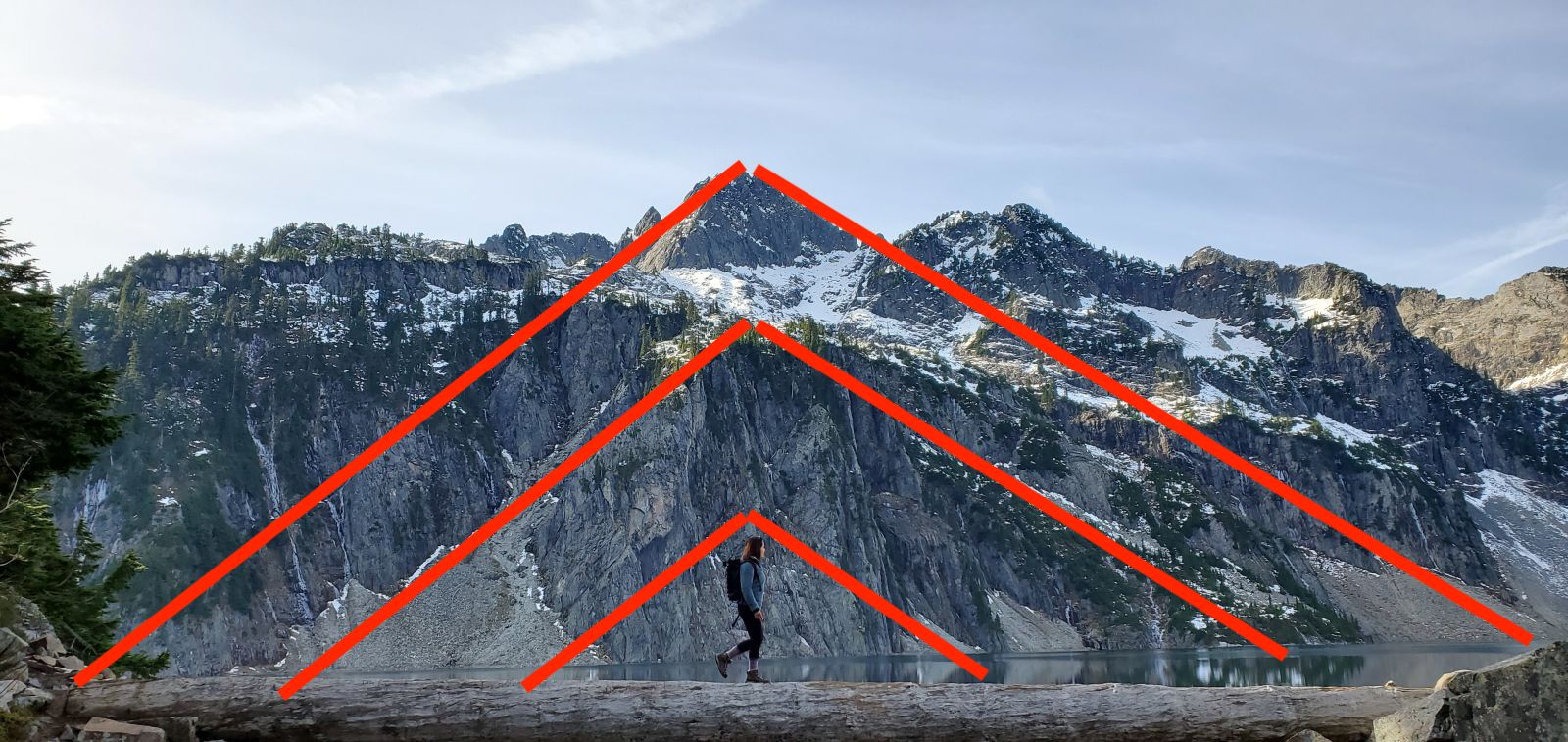
Rule of 1/3s is important, but it’s also okay to break it. Notice how the centered subject lines up with the centered, tallest peak. That makes for compositional triangles for days. It really makes the space feel bigger. If only it had the foreground material for added depth.
 Michael
> ttyymmnn
11/04/2019 at 22:58 |
|
Totally agree.
I also have to admit I know nothing about photography, and only learned that rule reading the owners manual for my parents’ 1980 Minolta camera. Beyond that guideline, I literally got nuthin’ for fancy picture takin’
:)
 vicali
> AestheticsInMotion
11/04/2019 at 23:09 |
|
Top is better light and a better composition- but I find the log and the lake too close, I know what you were getting at but it’s just a bit awkward.
PS is easy enough to clone/ stamp her over there but where’s the fun in that. I would rather you and your friend go out and shoot another 100 shots to help figure it out.
 ttyymmnn
> Michael
11/04/2019 at 23:14 |
|
Honestly, almost everything I know about photography and composition I learned by looking at fine art paintings. Ultimately, if a photo looks or feels right, it probably is.
Rule of thirds is definitely a big deal. Even with an off-center subject, it can impart motion either to or from somewhere, and give a sense of balance. Here’s a shot I took at an air show last spring.
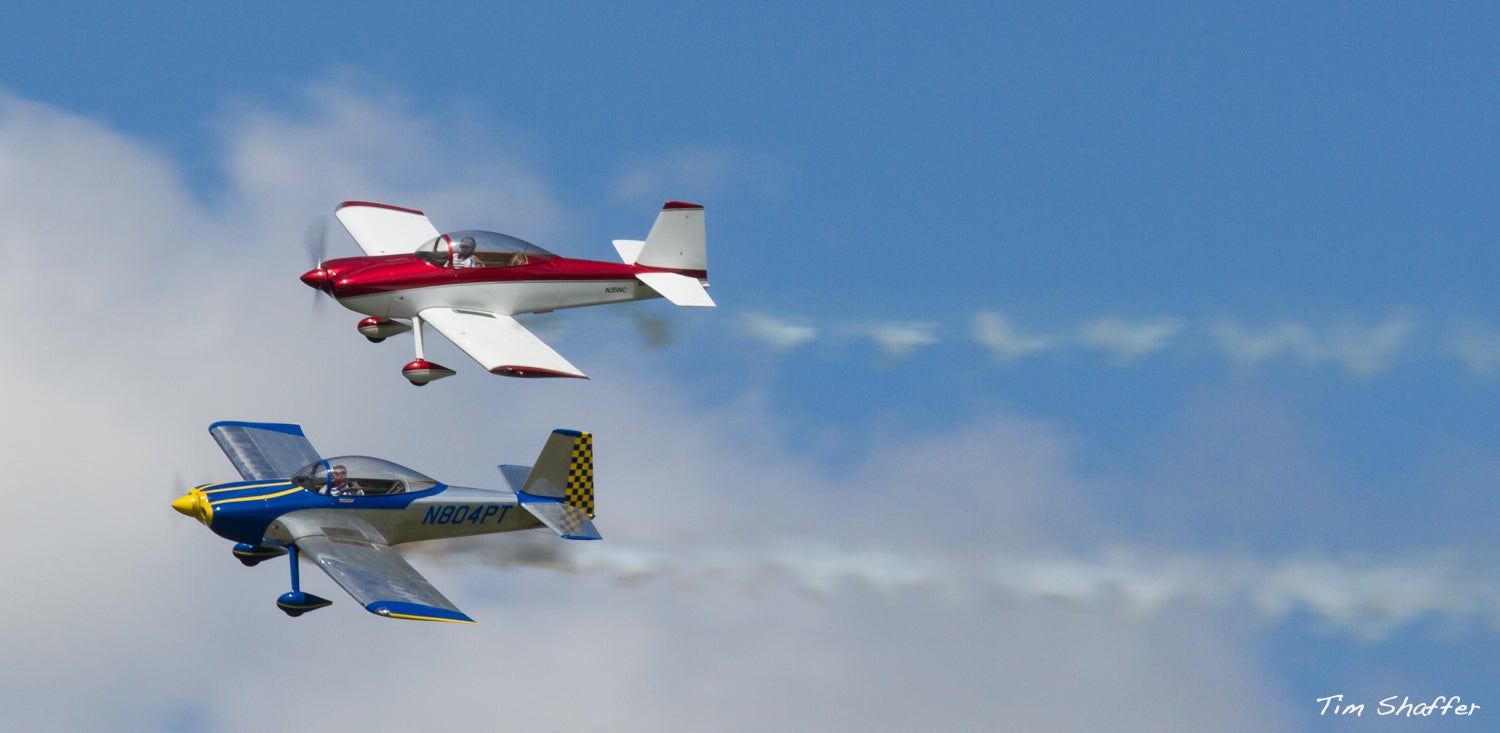
I could have put the aircraft in the center, but having them to the left (I believe) imparts speed and motion. The planes feel less frozen in space. Same with this shot of a MiG 17 from the same show. Not only is there lots of space for the jet to occupy as it moves to the right, the narrow crop helps make it feel faster.
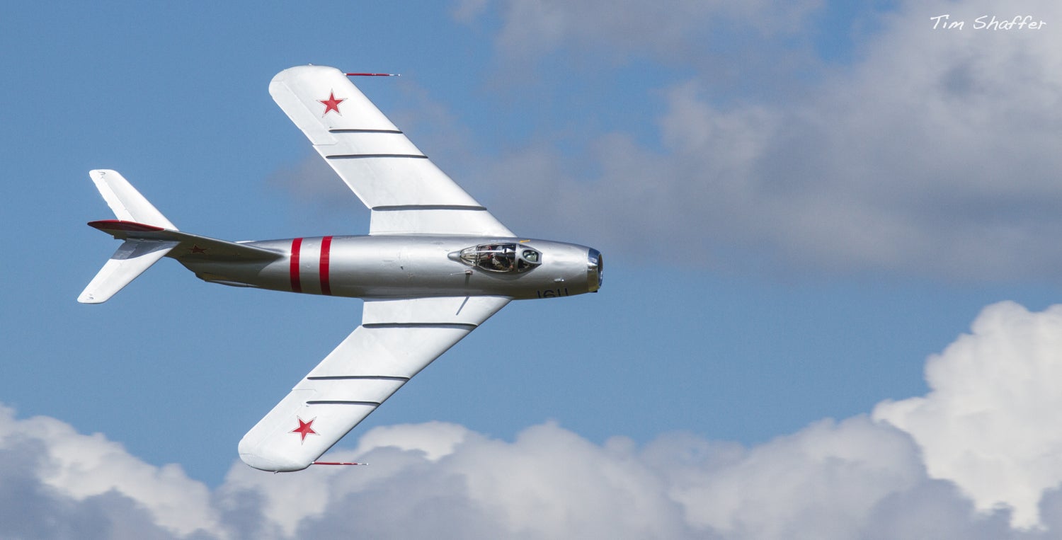
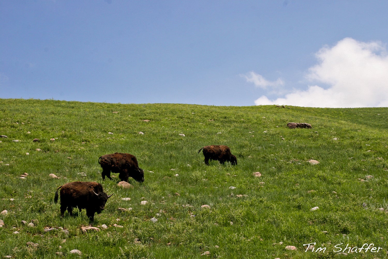
On the ground, the rule of thirds can pull the eye from the foreground to the background, and give a sense of scale, depth, or size. Notice that the rule also applies to the horizon. Best to have more ground or more sky, not a 50/50 split. This is a shot I took two summers ago in Custer SP in SD.
 CaptDale - is secretly British
> AestheticsInMotion
11/05/2019 at 00:00 |
|
top
 CaptDale - is secretly British
> CaptDale - is secretly British
11/05/2019 at 00:01 |
|
It is more appealing to have the whole log in for the framing.
 sonicgabe
> AestheticsInMotion
11/05/2019 at 01:05 |
|
Top picture gets my vote. The off-center person forces you to look around the picture. The lighting is better, too. And the foreground really gives it depth.
 pip bip - choose Corrour
> AestheticsInMotion
11/05/2019 at 01:54 |
|
2nd